Blogs have become a popular way for people to share their thoughts, ideas, and experiences with the world. However, with so many blogs out there, it can be challenging to stand out from the crowd. That’s where inspiration comes in. In this article, we will explore 10 inspiring blog page examples that demonstrate creativity, personality, and user engagement.
Blogs are hard work. As the owner of a blog, I can attest to this. I’ve spent many nights awake into the small hours trying to craft the perfect article for my readers.
So is it worth it?
Absolutely. Having a high-quality blog is essential for my business because it drives organic – and free – traffic to my website. And you know what free traffic equals? Revenue!
In this day and age, where everyone is competing for attention and that elusive top spot in search engine results, it’s never been more crucial to establish a blog on your website.
A blog establishes you (and your brand) as a market leader and authority in your niche. And the more people trust you, the more they will use your brand and share it with others.
But like I said. Blogs are no cakewalk, and you must put serious effort into crafting a beautiful blog page. I’m always studying other people’s blog pages to see what I can learn from them, and so should you. Check out my guide on how to start a successful blog here.
So, let’s take a look at inspiring blog pages together.
Table of Contents
10 Inspiring Blog Page Examples
The best way to get a feel for how a blog page should look and behave is by studying existing blogs. Start with the brands you like and admire, and work from there.
In the meantime, here’s my handpicked selection of inspiring blog page examples. They contain everything required to draw the reader in and capture their attention. I hope you like them as much as I do.
1. TechCrunch
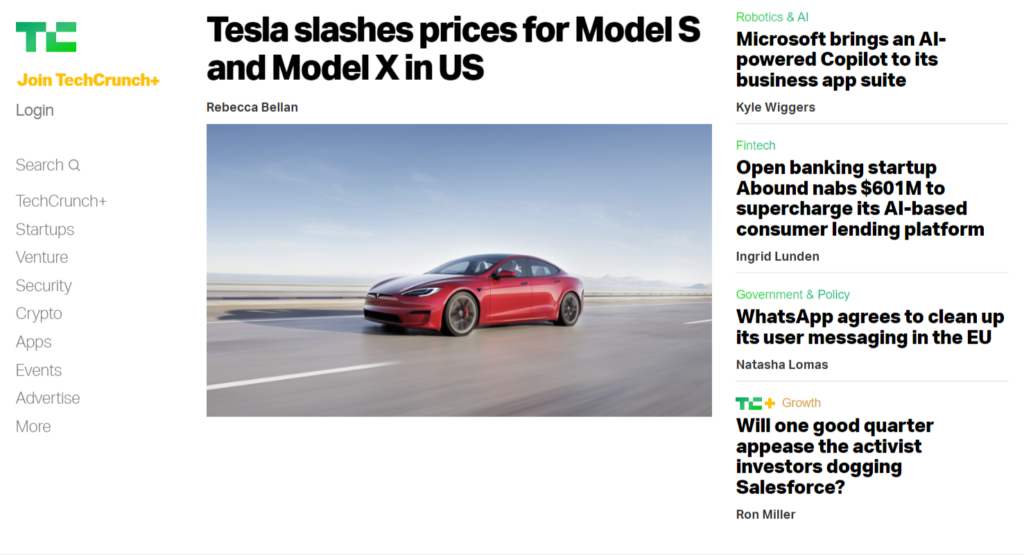
TechCrunch is an online blog/newspaper that focuses on providing articles for startups and high-tech businesses. It has been running since 2005 and has established itself as a trusted and reliable source of technology and digital-based information.
TechCrunch has a wide variety of free articles on its website, or you can sign up to access and read its premium TechCrunch+ content.
The platform deals with a lot of daily content, so articles move fast. Therefore, it’s essential that readers can find the latest headlines with ease and quickly search for topics they are interested in.
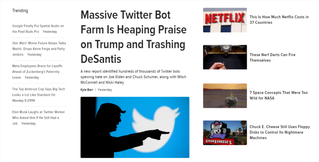
TechCrunch has addressed this by showcasing its breaking articles right at the top of the page. As you scroll down, you can view a list of “Latest” articles so you can see at a glance exactly what’s new.
If you’re looking for something specific, the page has a topic list displayed on the left-hand side of the screen, making it incredibly easy to click on various topics.
If you want to find something specific, there is a search bar to help you find what you are looking for.
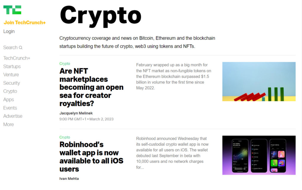
The blog page uses a highly-readable bold sans-serif font. Headlines are short and snappy but informative, while the short description tells you more about the article without having to click on it.
The images are relevant but are clearly taken from stock photo websites. However, since TechCrunch is producing multiple articles a day, we’ll let them off for this.
2. Stonyfield Organic
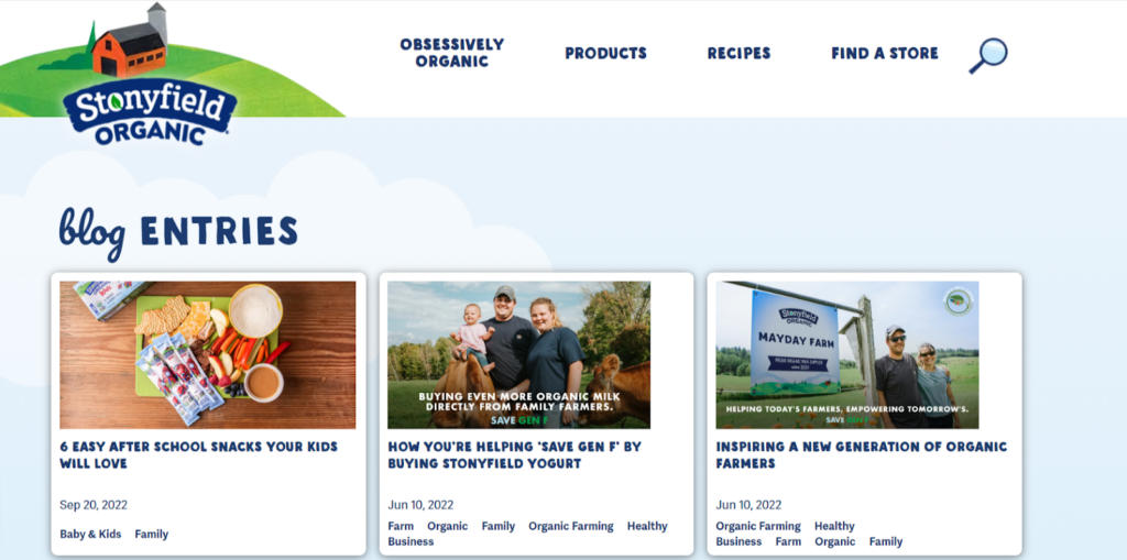
Stonyfield is an organic, family-run farm located in New Hampshire. The farm is home to 200,000 acres with thousands of dairy cows. Established in 1983, it produces yogurt and milk in a sustainable manner.
The site’s blog is a perfect example of producing a page that is precisely “on-brand.” Immediately you can see the consistent use of matching images and illustrations that go with the rest of the website.
It’s clear that when an appropriate photo cannot be found, they use an illustration created by the same designer or their logo. The result is a highly attractive page that invites you to click.
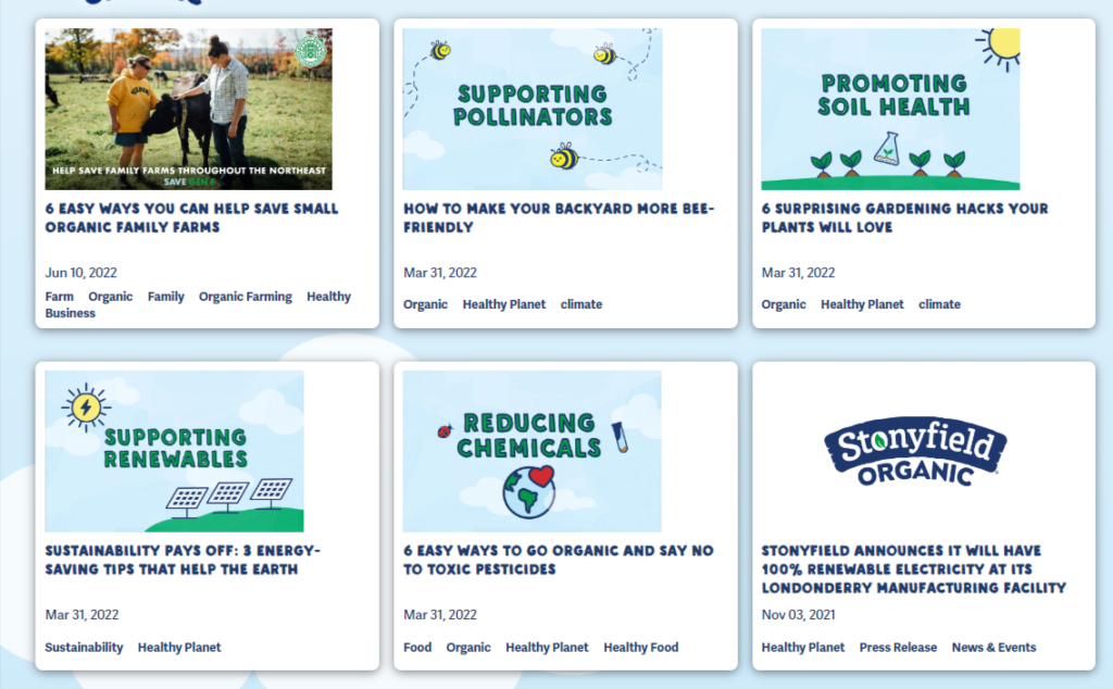
Rather than talk endlessly about the farm’s products. Stonyfield instead focuses on topics that are important to the reader. Sustainability, renewable energy, organic eating, and small farm practices are all common subjects and everything that the brand embodies.
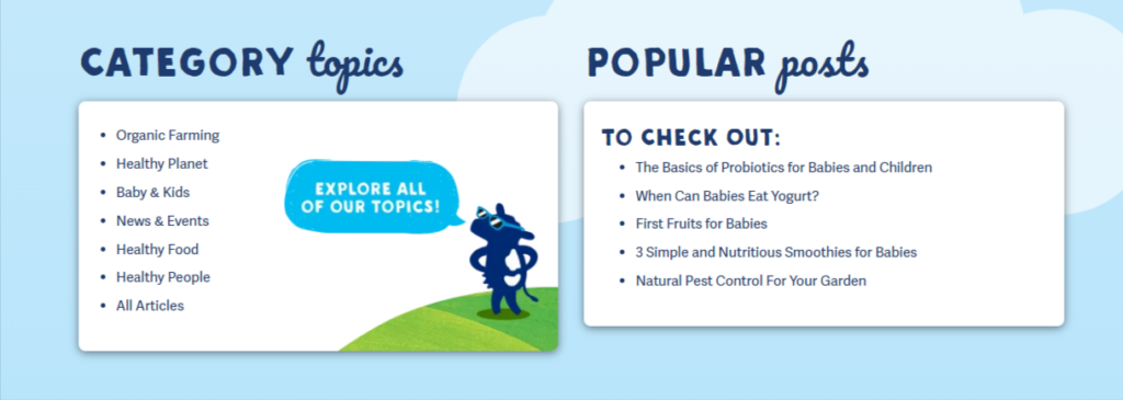
The page itself is neatly laid out using a friendly font for each blog title, along with keywords to help you understand more about the topic. While the page does not feature a search bar, there is a section allowing you to click on certain topics, which brings up relevant articles.
All in all, this is a great example of a cohesive design that encapsulates a brand in the best way possible.
3. Google
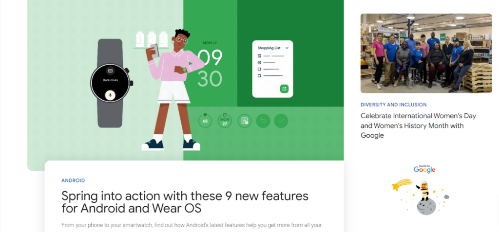
Google. The primary reason we strive to have worthwhile and searchable content on our websites. So it only stands to reason that the company provides a shining example of what a blog page should contain.
And it does shine. A business at the cutting edge of technology should absolutely make use of said technology where possible, and Google does this by adding an animated illustration to its featured article along with smooth interactions when you hover over its article thumbnails.
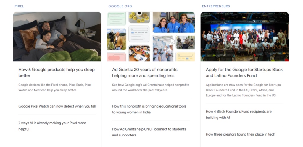
The page layout is complex, breaking away from the uniform “block” layout and instead features an asymmetric style that adds interest while still being easy to navigate.
Featured and latest articles are prominently displayed at the top of the page. As you scroll down, you are presented with side-scrolling sections that display article headings related to specific topics. This is a neat way of including a lot of information on a single page without it feeling cluttered.

Google clearly employs the help of a team of designers because many of the blog articles feature its signature style of illustrations. They’re mixed in with photo images, though, to add variety to the page. The use of Product Sans – Google’s own font – is highly readable for all.
In my opinion, Google has definitely nailed its blog page and has risen to its own high standards of what its search engines want.
4. Color Me Courtney
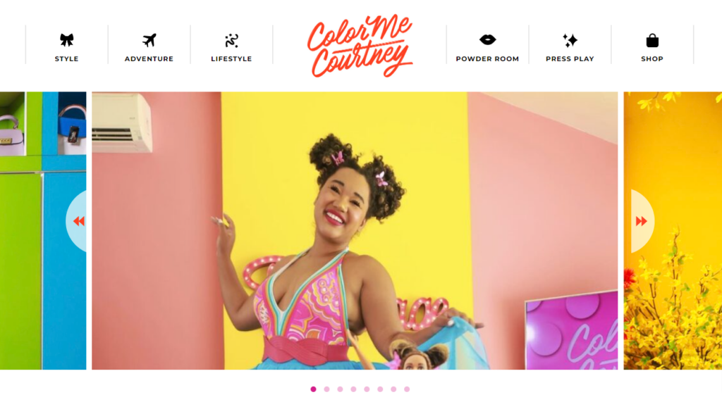
Few blog pages are as visually appealing as Color me Courtney. This New York-based fashionista incorporates her love of bright, bold colors into her blog. Her articles promote inclusivity and self-confidence and encourage her audience to “dress outside the lines.”
You don’t need me to tell you how much of a wow factor this blog page possesses. Immediately you are provided with a colorful feast for the eyes. Everything, from the images down to the color elements of the page itself, matches seamlessly to create a fun and playful design.
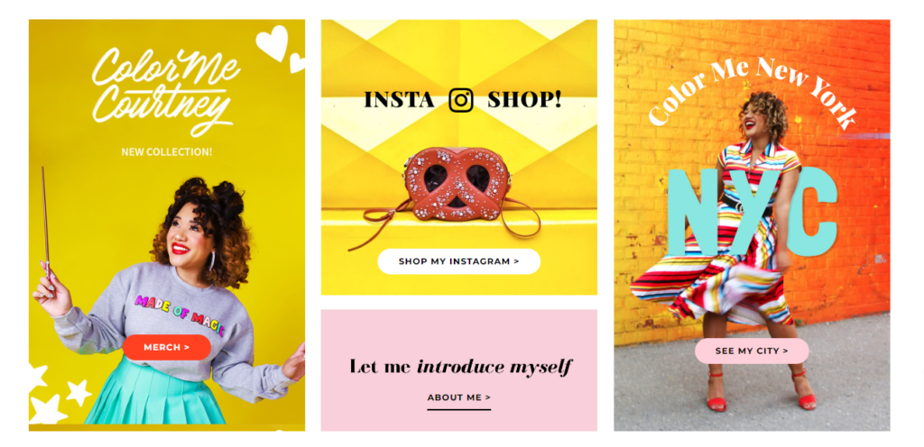
The page layout features scrolling banner images at the top to showcase featured articles. And as we scroll further down the page, there are lots of little sections to explore and click on.
The page is certainly busy, but it’s in keeping with the theme plus, it’s exciting to scroll around and discover each section, so it doesn’t matter that it’s not always apparent what each section is about. For those that want to find something specific, there is a search bar at the top of the page.
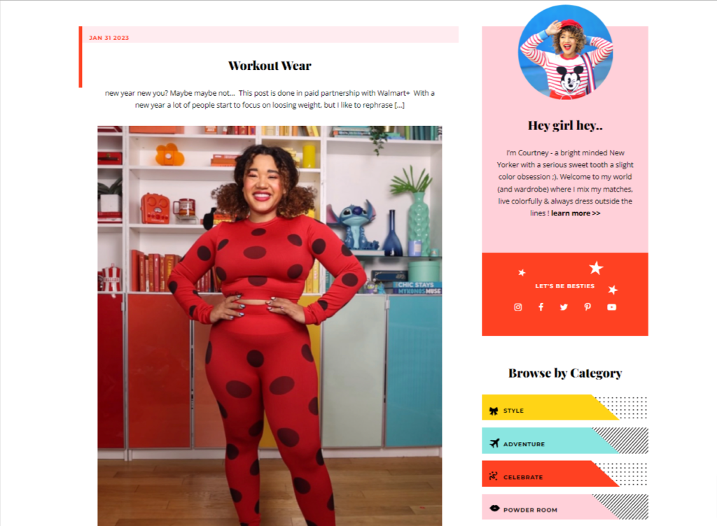
To add to the bright style, when you click on the “read now” button of the articles, you are treated to a little “pop” animation, and elsewhere on the page, you can find other cute animations and interactions.
Courtney clearly puts a lot of time and thought into the appearance of her blog, as the attention to detail is 10/10. When a blog is your main business, these things matter, and this is a perfect example to take inspiration from.
5. Starbucks
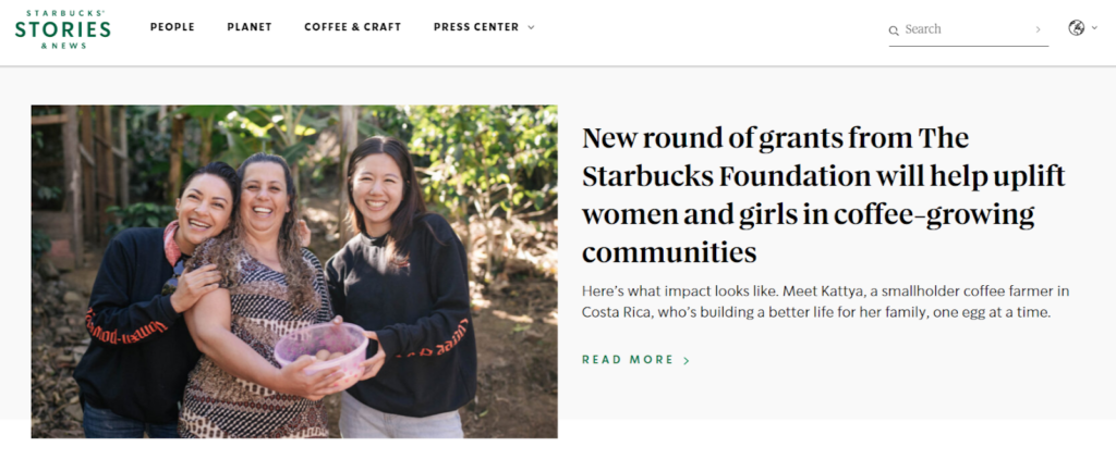
Okay, so Starbucks doesn’t really need any introduction. Nor does it require any assistance in getting its brand noticed in SERP results. Everyone knows what it is and what it does. But, that’s not the point of its blog.
Mega corporations and businesses can quickly become “faceless” and start to lack that all-important human element. This raises suspicion among customers who begin to resent the lack of transparency – particularly if the company has been in trouble for its less-than-ethical practices in the past.
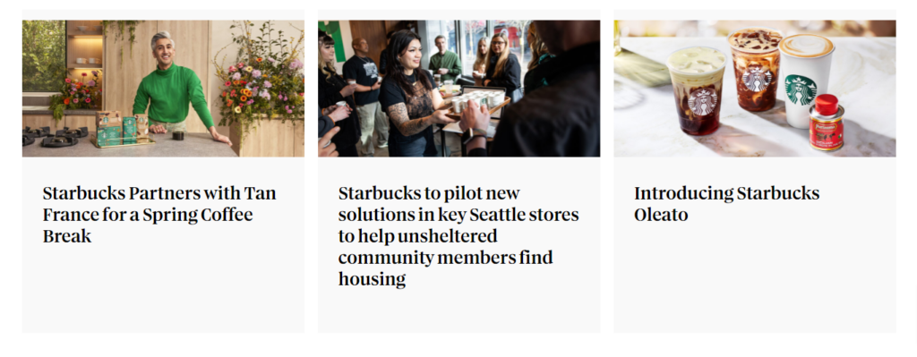
Starbucks’ blog attempts to change its “facelessness” and injects a healthy dose of humanism into its brand image. You’ll notice that the articles speak very little about the products and choose instead to highlight what the company is doing and the people it is working with, particularly what it’s doing to benefit local communities.
The blog also has a strong focus on how Starbucks is aspiring to be more sustainable and adopt ethical practices. Whether you believe the company is or not, it is certainly making a strong effort to appear so through its blog.
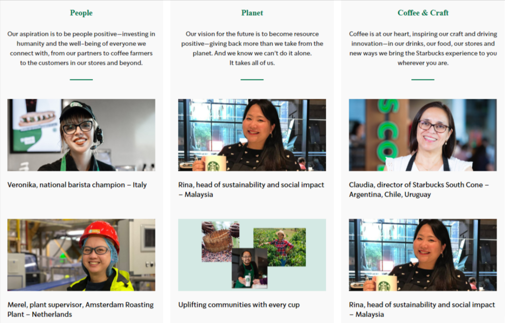
Despite being a brand that not everyone loves, I think we can agree that it has used its blog effectively to craft and shape its image in a more positive direction.
The page itself has a basic layout with image illustrations and clear, readable headlines. The font is very on-brand while still being accessible to most. While it’s not the most visually appealing page, it’s the content that bears the most importance here.
6. DJMag
DJMag is a monthly printed and digital publication dedicated to electronic music, DJs, and club culture. The UK-based company was founded in 1991 and is now circulated in multiple countries, including the US.
If you’re dealing with a niche as cool as electronic music, then you need to have a blog page to match. And DJMags blog page oozes coolness.
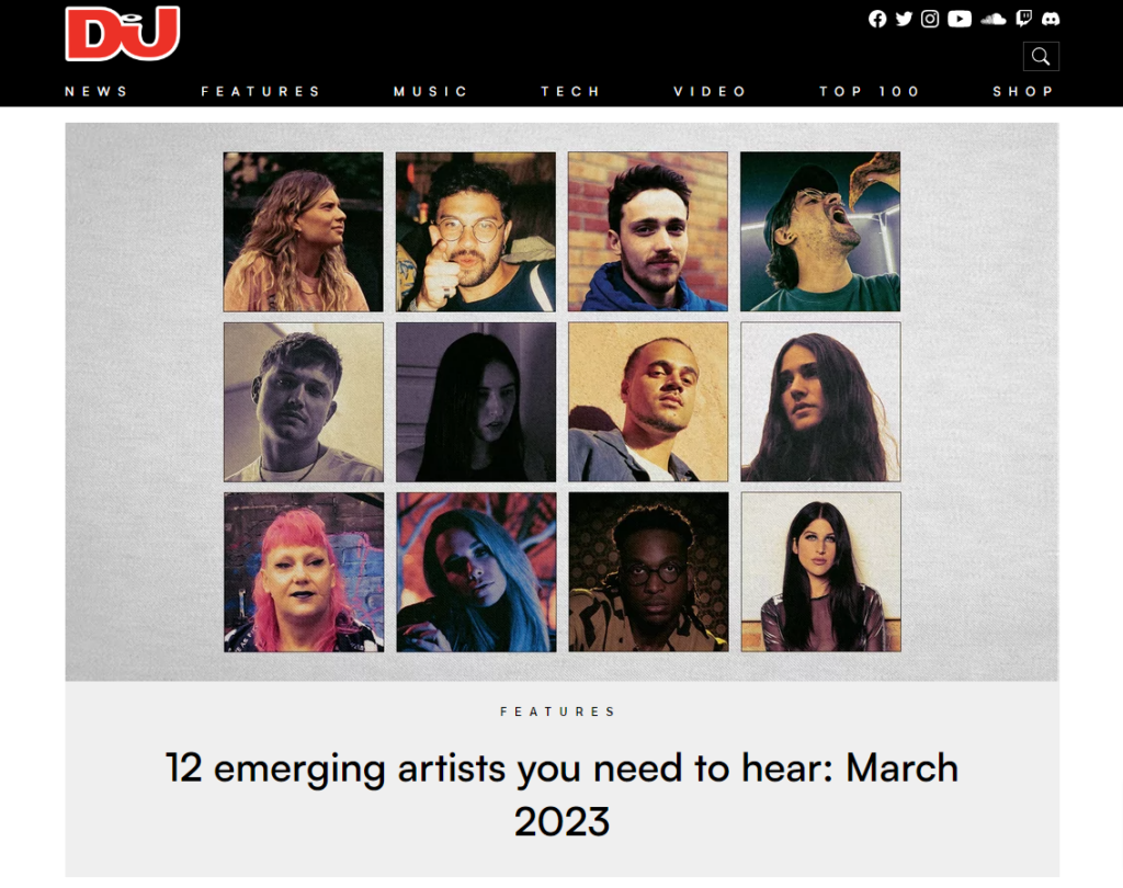
At the top of the page, you have a huge space for the site’s top article. While it’s basic in its design, the clever use of imagery is what stands out. The artist’s profiles have been carefully chosen so they blend seamlessly into a single image.
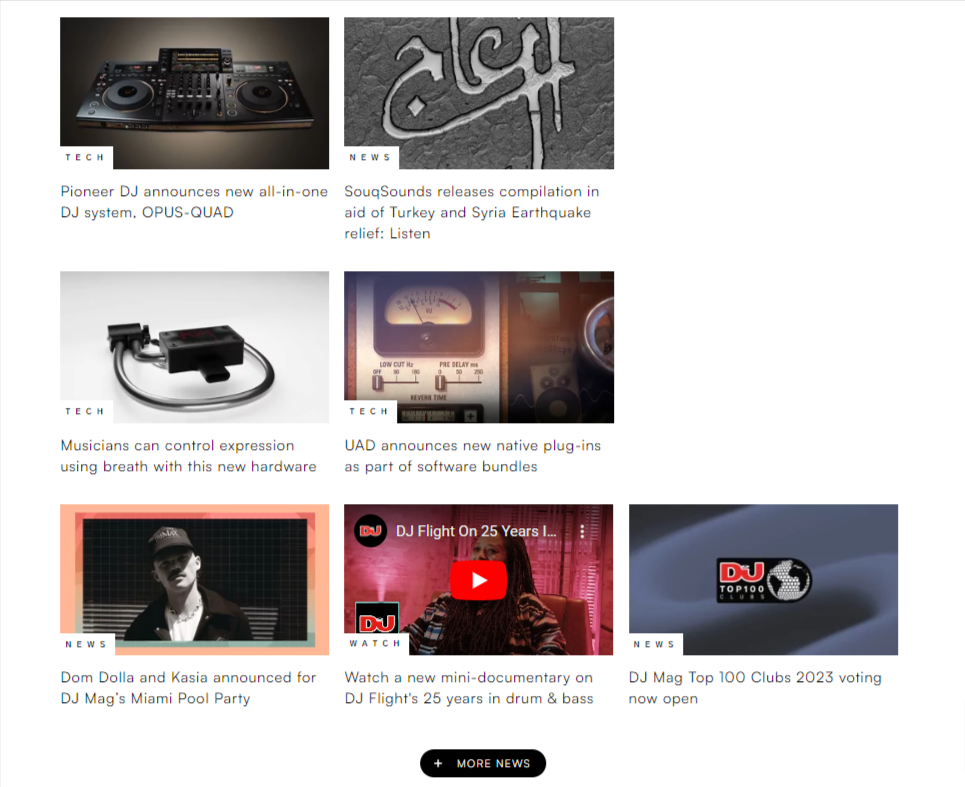
Throughout the page, you have further use of eye-catching artist images and production label logos. I particularly like the use of embedded YouTube videos. After all, it makes sense that a website dedicated to sound should actually feature some of it on its site.
The font used is clean sans serif, and interestingly, the blog headlines aren’t capitalized, making them feel more casual and matching the site’s overall style.
I also like the use of different-sized article posts rather than keeping them uniform. This allows an element of discovery for the reader while upping the page’s visual appeal. Many of the blog articles include embedded audio too.
Sites that have content behind a paywall usually frustrate me because they typically let you read the first few lines of the article before blocking access. I’d much rather these articles weren’t available at all for non-payers. DJMag is the exception here, as non of its blog content is restricted. It obviously keeps its paywall content elsewhere.
7. BarkBox
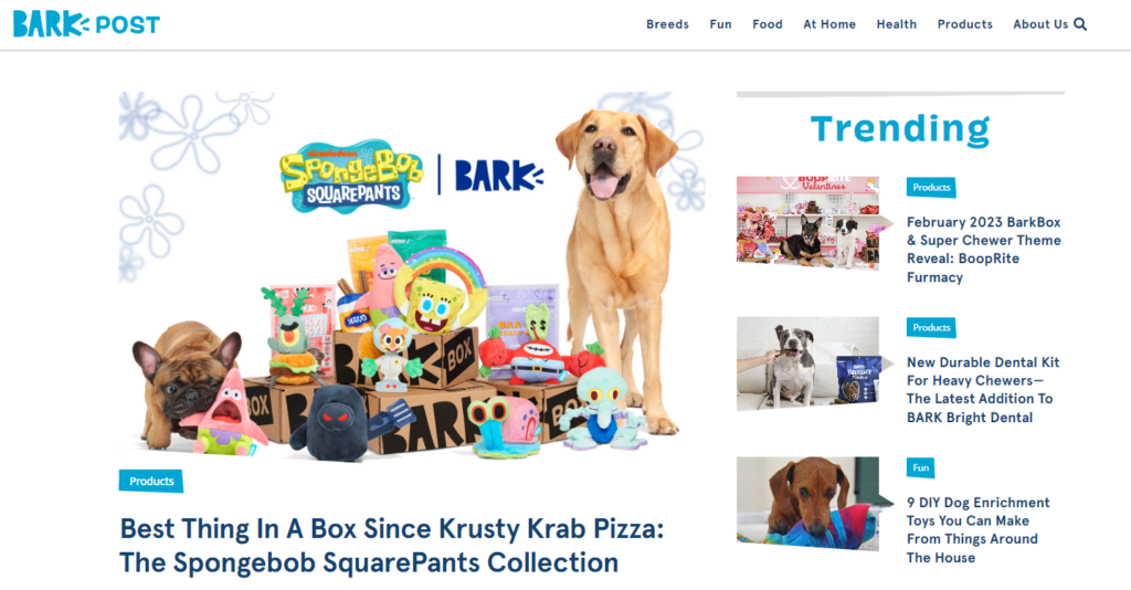
BarkBox is a company that creates and sends monthly themed boxes to dog owners. The boxes contain treats, toys, and other goodies based on a dog’s needs.
This is a fun blog page to match a fun product. Its playful use of imagery and cartoonish fonts add perfectly to the intended aesthetic without looking childish or amateur. And, of course, who doesn’t enjoy endless pictures of a man’s best friend?
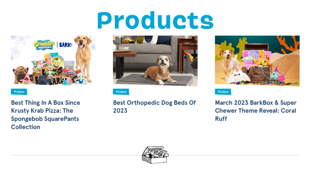
Every blog post thumbnail – no matter the subject – features an image of a dog. So while the images differ from one to the next, there’s always a coherent theme throughout.
The top of the page features the blog’s highlighted post, and I like the use of the “quick glance” bar on the right that showcases trending articles. Further down the page, articles are neatly arranged into categories, and you can always use the search bar to narrow things down.
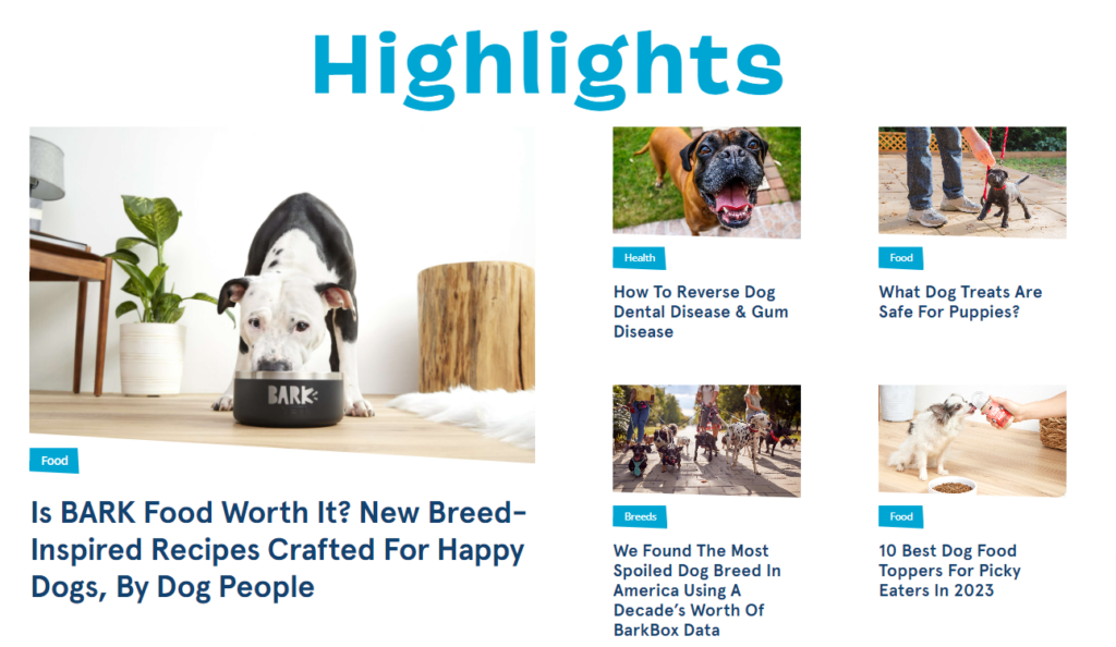
This blog is a really good example of a site that is a serious business but doesn’t take itself too seriously. The blog article titles are lighthearted and enjoyable while still providing worthwhile information to the reader.
Also, have I mentioned the pictures of dogs?!
8. Canva
If you’ve been reading my articles for a while, you’ll already know how much of a fan I am of Canva. This company loves to give away loads of stuff for free, and its blog page is chock full of valuable information to help its platform’s users get the best out of it.
Canva is a graphic design platform that makes it easy for just about anyone to create stunning designs for work, social media, advertising campaigns, and much more. (Check out my review of Canva Pro here).
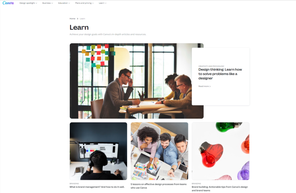
And a company focused on design, of course, has a highly attractive blog page. However, it’s not fancy and doesn’t include anything too “out there.” But that’s the point. Great design doesn’t need to be fancy.
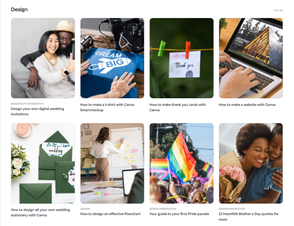
Instead, Canva has opted for a clean and clear layout and made use of carefully chosen imagery to support the blog article titles. At the top of the page, you can see larger thumbnails for the featured post, and scrolling over the images gives you a quick zoom animation.
The page is arranged into topic sections that you can expand to reveal more relevant articles, and each topic page has its own featured article image.
As well as a simple design, you’ll notice that this page does not have an article overview in its thumbnails. The reason for this is that it’s not needed. Instead, each article has a short, super concise headline. Upon reading each one, you know exactly what you will gain from reading the article.
Getting headlines on point is a rare skill, so I recommend studying them to get ideas for your own blog titles.
9. Gizmodo
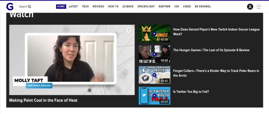
Gizmodo is a site that focuses on technology, security, science, and culture, as well as providing a large number of customer recommendations and reviews for electronic items. It produces a lot of content with multiple topics posted each day.
Any site that deals with a large amount of information needs to be well organized. And Gizmodo is. In fact, the layout is very similar to TechCrunch. The featured article has the largest spot at the top of the page, with other top articles listed to its right. Then you also have trending articles listed to the left.
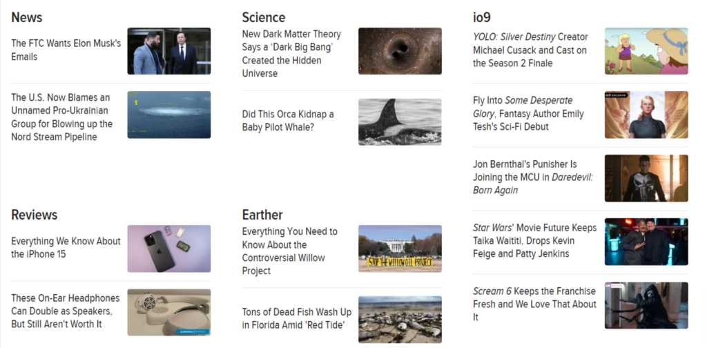
As you scroll down the page, you can see other articles neatly organized into categories, each with a relevant thumbnail image and an attention-grabbing headline. No blog article descriptions are needed here, either.
What is more interesting about this blog page is that some of the thumbnails feature GIFs or video clips. This immediately catches the eye above all the other page content and invites you to click to see what it’s about.

The page also features a video player where you can view trending video content without having to click off the page. This adds another layer of interactivity and invites the reader to linger on the page.
The typography used is bold and readable, and while the images are not the most exciting (possibly stock images), they are always relevant to the corresponding article title.
10. Maxomorra
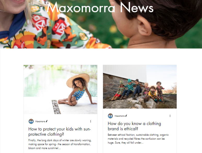
Maxomorra is a Swedish kid’s clothing brand known for its bright, colorful, and patterned designs. The company has a strong ethical stance and only uses sustainable, organic materials and manufacturing practices.
Maxomorra’s blog page is super minimal while still managing to be 100% on-brand. It’s probably the most basic page layout in this entire list and doesn’t have any featured posts or other additional elements.
Instead, you have a two-column thumbnail list where you can scroll down the page and view the article headers and descriptions.
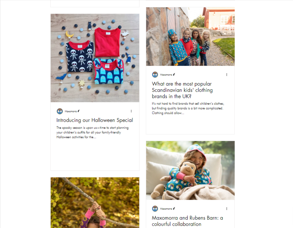
You’re probably asking why I’ve included it on the list if it’s so basic. Well, I just wanted to show that blog pages don’t have to be complicated, and a super simple one will do just fine as long as you have all the other elements right.
With Maxomorra’s, it’s the article images that stand out the most. All of them showcase the company’s distinctive clothing, either modeled by happy kids or displayed alongside matching props. It looks great.
And what doesn’t translate in the screenshots is that some of the blog titles have video clips that autoplay as you scroll through, which adds a dynamic element to an otherwise static page.
So you see, blog pages don’t have to be detailed or complex to be inspiring. Get your images on-brand and add in some video clips, and you get a stunning, minimalist page.
What is a Blog Page?
A blog page is a section of a website where an individual or company regularly posts written articles or entries, known as blog posts. These posts can be in the form of text, images, videos, or a combination of these formats. The purpose of a blog page is to share information, insights, or opinions on various topics with an audience that may be interested in the content.
A typical blog page will feature the latest post title at the top of the page, along with other recent posts listed below it. Each blog post tends to contain plenty of images plus an area at the foot of the post for readers to leave comments.
It is common for entire websites to be dedicated to blogging content and blog pages. In this case, the blog pages will be arranged into categories making it easier for the reader to find the type of content they are looking for,
Why a Blog Page Matters
A blog page matters because it allows individuals, businesses, or organizations to create and share valuable content with their audience, which can help establish their authority, credibility, and expertise in their respective fields. It can also improve website traffic, engagement, and search engine rankings, which can lead to more opportunities for growth and success.
Blogs are essential if you want your website to be found in organic search results. In other words, blogs exist to improve the SEO of a website. If your blog page contains well-crafted SEO-friendly content, it will likely appear on the first page of a Google search.
And the more blog pages you have on your website, the more indexed pages you have for search engines to find. So, regular blog content is a must to show Google that your website is active.
But there’s more.
Blog content needs to provide something worthwhile to its readers.
If you produce high-quality content that answers questions, solves problems, provides advice, or teaches someone something, then people will stick around to read it. The longer someone lingers on your blog page, the more likely they are to browse the rest of your website to see what you’re offering
What Should an Inspiring Blog Page Have?
The best bloggers and blog pages have put serious thought into their content, design and user experience. If you want to create a blog for your audience, these are the essential components of a well-crafted blog page:
- Well-organized content: People need to find the topics they are interested in easily
- Clear blog titles: What is each blog post about? Your title should reveal this at a glance
- Cohesive images: The images you use for your blog post thumbnails should reflect your brand
- A search bar: If readers are interested in a particular subject, then a search bar allows them to quickly find relevant content
- Fast loading speeds: Essential but often overlooked. If your blog page and posts are slow to load, readers will lose patience and move on
Frequently Asked Questions
Summary – Best Blog Page Examples To Help Inspire You
If you haven’t yet set up a blog page for your website, the time to do so is now. You could be missing out on vital free traffic, ultimately leading to more revenue.
Remember to take your time to create your blog page in an appealing way and optimize it for a great user experience.
Start posting regular blog posts and articles. Make sure the content is high-quality and valuable. And in time, you will see your traffic flourish.
If you’d like to get motivated from browsing through design solutions for other page categories, read my articles on:
