Although it won’t take the central spot on your homepage, your “contact us” page is an essential feature of your website, especially if you’re a business owner.
Your potential customers and website visitors will almost certainly look for your contact channels regardless of the type of website you run, so you shouldn’t take this page for granted.
To help you find a “contact us” page that matches your website’s aesthetic, I’ll review 10 inspiring “contact us” page examples that can help you customize the contact page on your site.
Table of Contents
Inspiring Examples of 10 Contact Us Pages
1. Ban.do
- Website: Ban.do
- Website type: E-commerce shop
Founded in 2008 and headquartered in sunny L.A. Ban.do is a unique e-commerce shop that offers all kinds of products. From clothing to pet supplies, Ban.do has an amazing range of products for everyone who’s into colorful and funky designs.
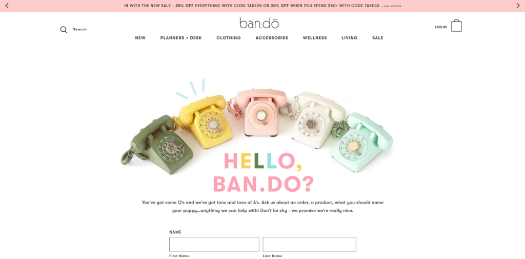
Ban.do’s contact page perfectly captivates the overall vibe of the brand. The first thing you’ll notice once you open it is the image of a few vintage phones and a very simple animation that resembles a ringing sound above them.
As you scroll down, you’ll see a pretty simple contact form where you can submit questions. Below it, there’s a telephone number that you can call to chat with Ban.do’s customer support.
There’s a section for returns under the telephone number, too. Once you click on it, you’ll be redirected to another page.
Why I like it: Ban.do’s contact page definitely stands out from the rest due to its amazing color palettes and their cute quips above the contact form. It’s very simple to navigate, and what’s most important, you don’t need to wait for a day or two to get an answer — you can simply call them and talk to their support staff.
2. Lush
- Website: Lush
- Website type: In-person and online cosmetics shop
It doesn’t surprise me at all that Lush has a unique-looking contact page. The one-of-a-kind, UK-based cosmetics retailer is pretty well-known for its witty product names, and it turns out they’re quite good in website design, too.
Since Lush is a brand that offers both online and in-person shopping all around the world, their contact page is well designed and quite easy to navigate. You’ll find it on the left side of the homepage footer.
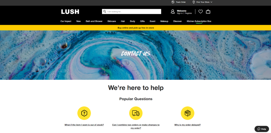
The first thing you’ll notice is a section with three popular questions. Below it, there’s a black rectangle that says “see all questions,” where you’ll be redirected to a list of the most frequently asked questions.
As you scroll down, you’ll see which days and hours you can get in touch with their customer support staff. There are four contact options that you can click on:
- Live chat
- Phone
- SMS text
- Virtual shopping
Why I like it: Unlike most websites, this one doesn’t have a generic contact form. Instead, there are four different contact options that you can choose from. If you’d like to get an answer as soon as possible, you can phone them. If you’d rather not talk on the phone, you can always text their staff or chat with them online.
3. Medium
- Website: Medium
- Website type: Social journalism; blogging platform
Founded in 2012, Medium is one of the leading online publishing platforms where you can find articles on all kinds of topics. It’s an open blogging platform where anyone can post an article on any topic they’d choose.
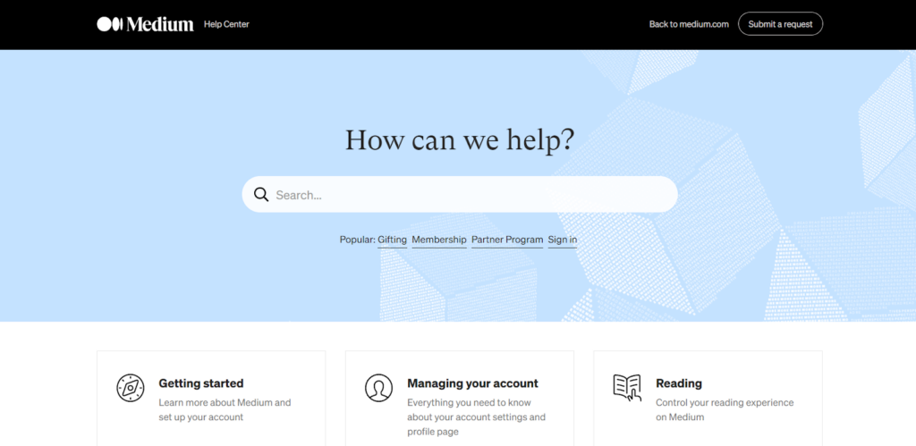
Medium’s website is pretty intuitive and user-friendly, and unlike some blogging platforms, it doesn’t have a generic contact page but a help page. Although the homepage has an infinite scroll, you’ll notice that several categories on the right remain in the same spot, even when you continue scrolling.
If you click on “help,” you’ll be redirected to an alternative page to a classic contact page where you’ll find various categories with questions and answers about your account, blog posts, writing, editing, etc.
If you can’t find what you’re looking for, you can click on “submit a request” in the top right corner, and you’ll be redirected to a page where you can choose a category where your question would fit best.
Why I like it: Medium offers a huge archive of questions and answers, so you can pretty much find everything (or at least almost everything) you’d want to know about it without contacting them and waiting for an answer.
You can always submit a request and ask your question if you can’t find what you’re looking for.
4. Marvel
- Website: Marvel
- Website type: Software company, UX/UI design platform
Based in London, UK, Marvel, also known as Marvel Prototyping, is a software company that launched an online platform for UX/UI design, wireframing, rapid prototyping, and user testing.
Marvel’s website is quite easy to navigate, and its contact page is very simple.
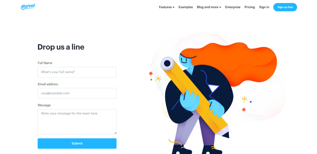
The contact page is placed in the footer of the homepage, under the category “company.” Once you click on it, you’ll notice a contact form on the left and a colorful illustration on the right.
As you scroll down, there are three different CTA options to choose from — “sale,” “support,” and “press kit.” If you click on “support,” you’ll be redirected to another page with a more extensive contact form where you can type your question.
In addition to the support options, there’s an address to Marvel’s headquarters in London.
Why I like it: This is how a simple yet effective contact page should look like. It contains all the necessary information, and its design interface is pretty minimalistic yet up-to-date and colorful. One detail that I really like is that there’s a “press kit” with all of Marvel’s product images and logos.
5. Spotify
- Website: Spotify
- Website type: Online audio streaming platform
Founded in 2006 and based in Stockholm, Spotify’s undoubtedly the leading audio streaming platform today. It has a very intuitive design, noticeable yet very simple typography, and an excellent color scheme.
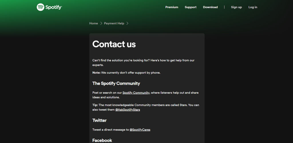
Spotify decided to keep things simple with its contact page, which is located in the footer of the homepage. Once you click on it, you’ll notice that there aren’t any playful or colorful designs but a sleek, minimalist-looking contact box where you can find all the necessary contact info about Spotify. There’s no telephone contact, but you can always ask a question in Spotify’s Community or reach out to their support staff by sending them an e-mail.
Why I like it: This contact page keeps things pretty easy and minimal, making it stand out from the rest in a different way — there’s no animation, no funky fonts, or colorful illustrations. I like the unembellished design approach and the green gradient in the left corner that we easily associate with Spotify these days.
6.Netflix
- Website: Netflix
- Website type: Media company, online streaming service
If you’re looking for inspiration for an online streaming service contact page, you should check out Netflix’s straightforward customer service page.
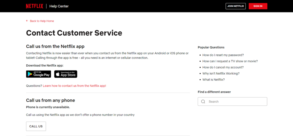
Just like the rest of Netflix’s user interface design, the contact page is pretty simple and clean-looking. It contains all the necessary information for Netflix users and website visitors, and you don’t need to spend your time looking around for them — everything is meticulously organized, just like the movies and shows on the streaming platform.
You can find the contact page in the footer of the homepage, and as you’ve probably already noticed — most websites that have an extensive amount of categories choose to place their contact page in the footer instead of the header of their homepage.
Why I like it: The best thing about Netflix’s contact page is that it offers several contact options — you can call them from their mobile app, from a phone, or start a live chat. On top of it all, there’s a list of popular questions on the right, and a search bar under it, so you can always try and find the answer you’re looking for before contacting their support staff.
7. The Charles
- Website: The Charles
- Website type: Digital agency
Brooklyn-based digital agency The Charles has one of my favorite contact pages ever. Most contact pages have a simple form and no unique design that makes them stand out, but that’s not the case with The Charles.
Their design layout is uncomplicated, stylish, and very up-to-date — just like the agency itself!
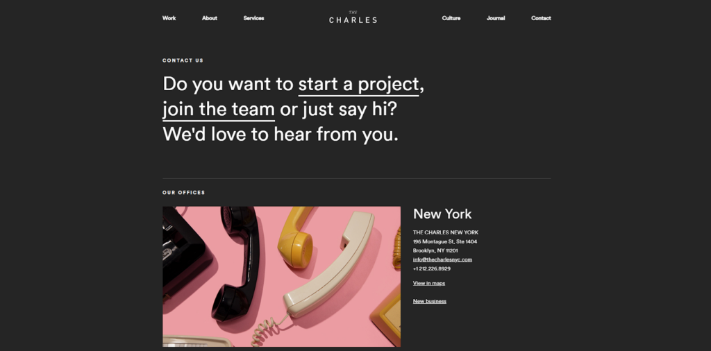
When you click on “contact,” you’ll be greeted with a question instead of a bland contact form. Want to collaborate with them or drop in to say hello to the team? With one click on “start a project,” you’ll be redirected to a new page with a questionnaire. If you click on “join the team,” you’ll see new job openings on another page.
As you scroll down, you’ll see contact information for their two additional offices in London and Chicago.
Why I like it: The Charles’ contact page is innovative, and it shows that there was a lot of team effort to create a whole questionnaire and invite website visitors to suggest collaborative projects to the agency.
8. Yeti
- Website: Yeti
- Website type: Outdoor drinkware and coolers company
Headquartered in Austin, Texas, Yeti is a billionaire drinkware and coolers company that has a great website with a very intuitive and user-friendly design.
You’ll find the contact page once you click on the three horizontal dots on the right. A vertical menu appears, and you can select a category.
Their contact page has a lot of information, which is always an excellent move that makes brands stand out from the crowd.
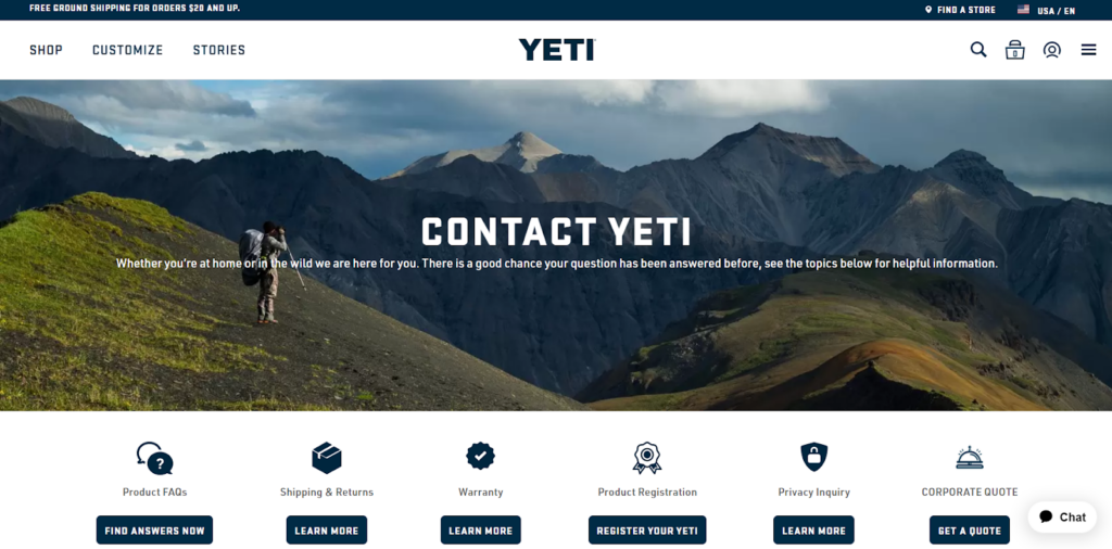
In addition to providing their customers with information on how to get in touch with their customer service team, corporate office, and corporate sales team, there are six additional sections that redirect you to new pages where you can learn more about the following:
- Product FAQs
- Shipping & Returns
- Warranty
- Product Registration
- Privacy Inquiry
- Corporate Quote
Why I like it: The typography is pretty unique, and the design is not complicated at all, yet the page contains so much information. Plus, there’s a lovely image of a person taking a photo of a beautiful mountain landscape that will captivate you instantly.
9. Canon
- Website: Canon
- Website type: Imaging, industrial, and optical products corporation
You might’ve heard of Canon as one of the biggest multinational imaging brands in the world that originates from Japan. They’re known for their innovative digital cameras that literally changed photography worldwide.
In addition to being a great brand with customers and fans from all over the world, Canon’s also pretty well-known for its amazing local websites, as well as its main website that has an excellent interface design.
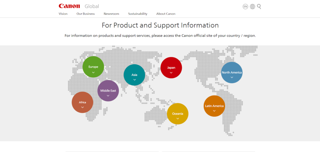
The contact page is on the footer of the homepage, and although it doesn’t have a lot of information, it still contains exactly what’s important — a world map with circle pins that show where Canon has official stores and websites… which is basically all over the world.
As you scroll down, you can click on “website feedback” and be redirected to a new page where you can select your location. I clicked on North America and was redirected to Canon USA. On the local site, you’ll find a customer support telephone, online support, and Canon Community support on Canon’s support page.
Why I like it: The design is very subtle yet effective; containing all the important information for several local websites in one “contact us” page is a pretty cool move. It gives me the impression that they truly care for their customers and don’t want them to feel stuck; they want to make sure you’ll always be able to reach out to their local customer service support.
10. Barnes & Noble
- Website: Barnes & Noble
- Website type: Online and in-person bookselling company
Saving the best for last, right?
Barnes & Noble is one of my favorite websites for years now. It has so much information and so many lovely illustrations; there’s always something fresh and new anytime I visit it!
Each and every category of this website is unique and filled with useful information for their customers, including their “help” page, where you can also reach out to their customer support team.
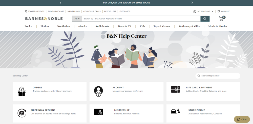
When you click on it, you’ll notice a gorgeous illustration created with warm, earthy colors and subtle elements. Then, you’ll notice they have several sections where you can find out more about specific services, such as orders, account settings, gift cards, etc.
Under this part, there’s a “contact us” button. Once you click on it, you’ll be redirected to another page where you’ll find a telephone number, chat, and e-mail contact.
Why I like it: I love that you’re greeted with a cheerful illustration and tons of information that can be quite useful. The “orders” button, for instance, is where you can find out all about shipping rules, returns, refunds, etc. Another thing that stands out is that they kept the design interface of their “contact us” page pretty simple.
What is a Contact Us Page?
As the name suggests, a “contact us” page is where you should share your business contact, so customers (and, hopefully, future clients) can contact you whenever they have a specific question or want to share feedback.
The “contact us” page should be easily accessible and easy to spot, so it’s ideal to put it in the top left or right corner of your homepage. This way, your customers won’t have to look around or browse the entire page to find it.
If you’d rather keep things minimal and place your contact in a not-too-distracting spot, you can put it in the footer or directly on your “about” page.
Most contact pages consist of a contact form where customers can ask and submit their questions or give feedback to the website owner.
In addition to that, brands can share the following on their “contact us” page:
- Shop locations: If you have a physical shop, include its address and opening hours on the contact page. This way, your customers can stay assured that your business is legitimate.
- email and telephone number: By adding an e-mail and a telephone number, customers will always know where and how to contact you.
- Average response time: In addition to the e-mail, you can add an average response time.
Why a Contact Us Page Matters
After all, the easiest and most honest way for conscious business owners to show they care for their customers is by allowing them to contact them whenever they have a specific question or when they’d like to give honest feedback about a product or a service.
In addition to being one of the most helpful pages for your customers, it can help you administer media inquiries. So, if anyone needs to contact you about your business, they can always check out your “contact us” page.
Frequently Asked Questions
Summary – Examples of Inspiring Contact Us Pages
I hope that you enjoyed reading this article and that now you feel inspired to create a custom-made “contact us” page for your website!
If you’d like to get motivated from browsing through design solutions for other page categories, read my articles on:
