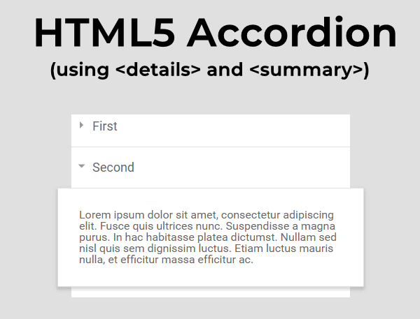
Did you know that there’s a native HTML5 solution to very easily create an accordion read more/less button to hide and reveal content with NO JavaScript or CSS. Read on to find out how.

The <details> and <summary> HTML5 tags are officially a disclosure widget element, but the <details> paired with <summary> HTML5 tags will give you a pure HTML-only accordion.
Meaning no JS OR CSS is needed. How cool is that!
Here is an example showing a simple element with a <details> and <summary>.
Here’s the code:
<details>
 <summary>Read More</summary>
  <p>This is a native HTML5 accordion to hide and reveal content. Pretty cool, right?</p>
</details>
and here’s how it will look:
Read More
This is a native HTML5 accordion to hide and reveal content. Pretty cool, right?
How does it work? The <details> tag serves as a wrapper for an element that can be opened or closed. The user has to click on the label that is the <summary> tag to open or close the element.
What about styling and behavior?
Styles
You can apply CSS styling to customize the appearance of the reveal text box. The below gives a tabbed interface style:
details {
  font: 16px "Open Sans", Calibri, sans-serif;
  width: 620px;
}

details > summary {
  padding: 2px 6px;
  width: 15em;
  background-color: #ddd;
  border: none;
  box-shadow: 3px 3px 4px black;
  cursor: pointer;
}

details > p {
  border-radius: 0 0 10px 10px;
  background-color: #ddd;
  padding: 2px 6px;
  margin: 0;
  box-shadow: 3px 3px 4px black;
}

details[open] > summary {
  background-color: #ccf;
}
By default, the cursor appears like an arrow, but if you want it to be a pointing hand instead then use this:
details {
cursor: pointer;
}
Behaviors
Setting behaviors is very limited, there is really only one thing you can do and that is to make the revealed text open by default.
To start the accordion in its open state, add the Boolean open attribute to the <details> tag:
<details open>
 <summary>Read More</summary>
  <p>This is a native HTML5 accordion to hide and reveal content. Pretty cool, right?</p>
</details>
Read More
This is a native HTML5 accordion to hide and reveal content. Pretty cool, right?
What attributes can I use?
The below attributes can be used for the <details> tag:
| Attribute | Value | Summary |
|---|---|---|
| open | open | Default is not open. |
| id | value | Provides a unique identifier. |
| class | classnames | Assigns class names to the element. |
| style | CSS-values | Assigns CSS styles to the element. |
So what are the limitations? There’s always a catch, isn’t it?
No support for Internet Explorer
This HTML5-only accordion won’t work in any version of Internet Explorer. If you have to have it support IE11 you will have to use a different fallback solution using JQuery. All other browsers support <details> and <summary>.
No customized animations or transitions
While you can modify and style the appearance (as shown above), you won’t be able to do any text reveal animations or transitions. If you want to do that you’ll need another CSS/JSS accordion solution.
Screen readers and accessibility
This is native HTML5 and it *should be* accessible but has been found that the actual revealed text isn’t always announced correctly by a screen reader.
References:
